Menu
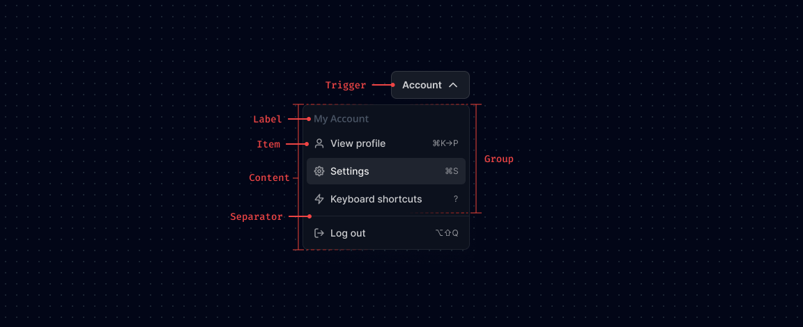
Anatomy
Props
Menu
The root component that manages the open state and context of the menu.
| Prop | Type | Default | Description |
|---|---|---|---|
open | boolean | false | The controlled open state of the menu. |
defaultOpen | boolean | false | The default open state when initially rendered. Use when you do not need to control the open state. |
onOpenChange | (open: boolean) => void | - | Event handler called when the open state of the menu changes. |
Menu.Trigger
The button that toggles the menu. The menu content will position itself against the trigger.
| Prop | Type | Default | Description |
|---|---|---|---|
asChild | boolean | false | Change the default rendered element for the one passed as a child, merging their props and behavior. |
disabled | boolean | false | Whether the trigger is disabled. |
Menu.Content
The component that pops out when the menu is open. Contains all menu items.
| Prop | Type | Default | Description |
|---|---|---|---|
asChild | boolean | false | Change the default rendered element for the one passed as a child, merging their props and behavior. |
loop | boolean | false | When true, keyboard navigation will loop from the last item to the first, and vice versa. |
side | top | right | bottom | left | "bottom" | The preferred side of the trigger to render the menu against. |
sideOffset | number | 0 | The distance in pixels from the trigger. |
align | start | center | end | "start" | The preferred alignment against the trigger. |
alignOffset | number | 0 | An offset in pixels from the start or end alignment options. |
onInteractOutside | (event: Event) => void | - | Event handler called when an interaction occurs outside the menu. |
onCloseAutoFocus | (event: Event) => void | - | Event handler called when focus moves to the trigger after closing. |
Menu.Item
An individual selectable item within the menu.
| Prop | Type | Default | Description |
|---|---|---|---|
asChild | boolean | false | Change the default rendered element for the one passed as a child, merging their props and behavior. |
disabled | boolean | false | Whether the menu item is disabled. |
onSelect | (event: Event) => void | - | Event handler called when the user selects an item via mouse or keyboard. |
value* | string | - | The unique value of the menu item. |
Menu.Group
Used to group multiple related menu items together.
| Prop | Type | Default | Description |
|---|---|---|---|
asChild | boolean | false | Change the default rendered element for the one passed as a child, merging their props and behavior. |
Menu.Label
A non-focusable label used to name a group of menu items.
| Prop | Type | Default | Description |
|---|---|---|---|
asChild | boolean | false | Change the default rendered element for the one passed as a child, merging their props and behavior. |
Menu.Separator
A visual separator used to divide menu items.
| Prop | Type | Default | Description |
|---|---|---|---|
asChild | boolean | false | Change the default rendered element for the one passed as a child, merging their props and behavior. |
orientation | horizontal | vertical | "horizontal" | The orientation of the separator. |
Menu.Arrow
An optional arrow element to render alongside the menu. Helps visually link the trigger with the menu content.
| Prop | Type | Default | Description |
|---|---|---|---|
asChild | boolean | false | Change the default rendered element for the one passed as a child, merging their props and behavior. |
width | number | 10 | The width of the arrow in pixels. |
height | number | 5 | The height of the arrow in pixels. |
Menu.CheckboxItem
A menu item that can be controlled and rendered like a checkbox.
| Prop | Type | Default | Description |
|---|---|---|---|
asChild | boolean | false | Change the default rendered element for the one passed as a child, merging their props and behavior. |
checked | boolean | indeterminate | false | The controlled checked state of the checkbox item. |
onCheckedChange | (checked: boolean | 'indeterminate') => void | - | Event handler called when the checked state changes. |
disabled | boolean | false | Whether the checkbox item is disabled. |
Menu.RadioGroup
Used to group multiple radio items together.
| Prop | Type | Default | Description |
|---|---|---|---|
asChild | boolean | false | Change the default rendered element for the one passed as a child, merging their props and behavior. |
value* | string | - | The value of the selected radio item. |
onValueChange | (value: string) => void | - | Event handler called when the selected value changes. |
Menu.RadioItem
A menu item that can be controlled and rendered like a radio button within a group.
| Prop | Type | Default | Description |
|---|---|---|---|
asChild | boolean | false | Change the default rendered element for the one passed as a child, merging their props and behavior. |
value* | string | - | The value of the radio item. |
disabled | boolean | false | Whether the radio item is disabled. |
Menu.Sub
Contains all the parts of a submenu.
| Prop | Type | Default | Description |
|---|---|---|---|
open | boolean | false | The controlled open state of the submenu. |
defaultOpen | boolean | false | The default open state when initially rendered. |
onOpenChange | (open: boolean) => void | - | Event handler called when the open state of the submenu changes. |
Menu.SubTrigger
A menu item that opens a submenu. Must be rendered inside MenuSub.
| Prop | Type | Default | Description |
|---|---|---|---|
asChild | boolean | false | Change the default rendered element for the one passed as a child, merging their props and behavior. |
disabled | boolean | false | Whether the submenu trigger is disabled. |
Menu.SubContent
The component that pops out when a submenu is open. Must be rendered inside MenuSub.
| Prop | Type | Default | Description |
|---|---|---|---|
asChild | boolean | false | Change the default rendered element for the one passed as a child, merging their props and behavior. |
loop | boolean | false | When true, keyboard navigation will loop from the last item to the first. |
sideOffset | number | 0 | The distance in pixels from the trigger. |
alignOffset | number | 0 | An offset in pixels from the alignment options. |